31 October 2010

Channel 9 The Block – Mark & Duncan’s reno review

I’m sure many of you have also been watching The Block on Channel 9 wondering who is going to win the prize and get the highest price on auction day! Since I have been watching the show every week myself, I thought I’d give my views on the designs and decoration so far. Over the next few posts I will comment on the different apartments and styles. It will be interesting to see what sells on the day.
A quick look at RP Data to understand the demographics of Vaucluse and most households earn > $130k, are mostly professionals and 60% of the households have children versus 25% couples with no kids.
image
Mark & Duncan – the 2 tradies
image
Highlights:
I think the study/guestroom in bedroom 3 is a highlight with the build in shelf space that would also double as a great kids room.The ensuite with the extra large shower space is a great idea and will definitely add value. I always try to play with the floorplan to maximise space and move walls where it makes sense. I also really like the modern slimline basin Omvivo Linea from Reece. I love that they squeezed a bathtub into the main bathroom. Even though a shower over a tub isn’t ideal, if you can find a way to get a bath tub in, you will maximise return – especially for households with young children who will expect a bath. They also have a good amount of space in the master bedroom as well as some nice storage – lots of drawers and that great recess above the bed for books and trinkets. Another great idea.
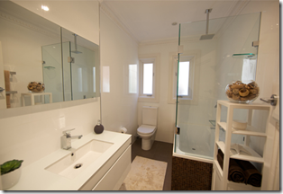
image imageimage 
Mark & Duncan Lowlights:
In general I am not mad about the colour palette – too many creams and browns. It is very traditional and quite masculine. That being said, it will definitely appeal to a more conservative buyer, an older demographic especially couples with older children. The bulkhead makes the ceilings look lower and again are very traditional. I am not convinced about all the expenditure on technology and would prefer them to invest those $$ on decoration.
General Summary -
The boys really have a practical approach to their property and use clever joinery which adds a lot of value. At the end of the day, people need lots of storage in apartments. They also want as much room as possible and at the end of the day, a really well styled room will drive the price up, but as long as the style appeals to the buyer. The boys might not be decorators, but they are improving as the show progresses and have good odds to win at auction day. Got a question for mark and Duncan? You can email them or view their blogs and gallery for more info.

29 October 2010

Most beautiful bathroom in Australia?

Could this possibly be the most beautiful bathroom in Australia? From first discovering an outdoor bathroom on my first trip to Bali many years ago, I always loved the idea of showering outdoors with birds and lizards – and hopefully no pervy neighbours. There is nothing nicer than a shower amongst the trees.

But I think this bathroom in Rachel Bending’s (Bird Textiles founder) Byron Bay home is possibly the most gorgeous one I have ever seen. It just seems so decadent. Of course, not so appealing on a chilly winters night, but imagine with candles, the moonlight, a glass of wine (sigh). Oh how I would like a bath right now.

For a full tour of her sustainable home, check out the Home Beautiful website - styled by my good friend Stephanie Powell.

Oh what a clever designer.

24 October 2010

So in love with Olioboard – vote now

Oh I am so in love with Olioboard. I sometimes find moodboards a bit clumsy. They remind me of primary school. They are fun, but I never think they look particularly professional. Then I read about Olioboard on Apartment Therapy and wowzers – how cool! Glue and scissors no more!

Check out the below real life comparison and vote on which you prefer!

This is a client brief I have for a house in Sydney. The client has an classic heritage house at the front and is building a new wing out the back which is totally modern, concrete floors, high ceilings, clean lines. She wants to fuse the new with the old. She likes the house to be neat but not sterile, and wants to inject personality through her furnishings.

Exhibit A – the original mood board I created the old paper and scissors way…

mood board2

Exhibit B – my new Olioboard version of the same client brief.

OB-client brief

I’d love to hear your comments on which one you like better – the original or the olioboard version??

22 October 2010

I’m Back!

I’ve been away a while, but now I am back, with lots of design inspiration from around the globe and some local projects too. Let’s start with a couple of my favourite designers currently in the USA:

Ghislaine ViƱas - http://www.gvinteriors.com/

Downtown, a Love Story

Check out interiordesign.net and cococozy for more.

And of course Kathryn Ireland for increadible bohemian, moroccan, mexican inspired textiles, prints and textures.

Take a tour of her home: http://www.housebeautiful.com/decorating/ireland-bold-bright-0308

030910kathrynireland-07

Related Posts with Thumbnails