08 November 2010

Channel 9 The Block – Brenton & Chez Reno Review

I’ve been having a good look at the photos on the Channel 9 The Block website of Brenton and Chez’s apartment. There are quite a few things I like and others I am not so sure. But like all the couples, they are doing a brilliant job considering the pressure and weekly room deliveries. Chez should have a bit of a head start as a real estate agent and with an interior design diploma, so she should have excellent experience to bring to her renovation. Here is my impression of what I have seen so far.

Brenton & Cheryl:

image

Apartment Highlights:

Chez has great taste in light fittings. She uses a very neutral colour palette of grey on grey. The repaint of the floorboards in the first room to a darker stain was a great idea and makes this room look classy, warm and inviting. I love the custom made curved shower screen from Bent and Curved Glass in the main bathroom is a real statement piece, adding a sophisticated touch to the room and will appeal to the Vaucluse demographic. The dark pull down blinds again bring warmth to the room and are also very practical. Chez also introduces some great textures in her rooms with the bedding and fabrics and her rooms are relevant to both male and female buyers which will widen the appeal on auction day. The little hidden make up table in the master bedroom tucked behind the beam is a brilliant use of space. The restoration of the original cornices is a total highlight and brings out the art deco theme.

image image image 

Apartment Lowlights:

While the colour scheme travels throughout the house, I find it is a bit monochromatic. This is not a bad thing as it allows buyers to inject their own personality with a splash of colour, but it also doesn’t pop as a colour combination. The sliding doors in the hallway were a very bold choice – and one that may not appeal to the masses. The wallpaper choice from Croker Paints is a little OTT – it would have worked better in a smaller area. The majority of furnishings are from Freedom Furniture. I know they are key sponsors but it would be good to see a little more variety. The bathroom is missing a bathtub and this could impact the decision of the family demographic. Also, with 3 double bedrooms I am a little confused who they are appealing to. It seems like the shared house of professionals, but I am not sure. A purpose built study or childrens room might have been a better choice.

General Summary:

I am not 100% sure Brenton and Chez will be the winners, but they still have a few rooms to go. They have a neutral palette which is appealing, but I don’t feel like they have really pushed the style which has a very subtle art deco reference. The whole apartment does not really gel – it feels like it is missing the wow factor.

31 October 2010

Channel 9 The Block – Mark & Duncan’s reno review

I’m sure many of you have also been watching The Block on Channel 9 wondering who is going to win the prize and get the highest price on auction day! Since I have been watching the show every week myself, I thought I’d give my views on the designs and decoration so far. Over the next few posts I will comment on the different apartments and styles. It will be interesting to see what sells on the day.
A quick look at RP Data to understand the demographics of Vaucluse and most households earn > $130k, are mostly professionals and 60% of the households have children versus 25% couples with no kids.
image
Mark & Duncan – the 2 tradies
image
Highlights:
I think the study/guestroom in bedroom 3 is a highlight with the build in shelf space that would also double as a great kids room.The ensuite with the extra large shower space is a great idea and will definitely add value. I always try to play with the floorplan to maximise space and move walls where it makes sense. I also really like the modern slimline basin Omvivo Linea from Reece. I love that they squeezed a bathtub into the main bathroom. Even though a shower over a tub isn’t ideal, if you can find a way to get a bath tub in, you will maximise return – especially for households with young children who will expect a bath. They also have a good amount of space in the master bedroom as well as some nice storage – lots of drawers and that great recess above the bed for books and trinkets. Another great idea.
image imageimage 
Mark & Duncan Lowlights:
In general I am not mad about the colour palette – too many creams and browns. It is very traditional and quite masculine. That being said, it will definitely appeal to a more conservative buyer, an older demographic especially couples with older children. The bulkhead makes the ceilings look lower and again are very traditional. I am not convinced about all the expenditure on technology and would prefer them to invest those $$ on decoration.
General Summary -
The boys really have a practical approach to their property and use clever joinery which adds a lot of value. At the end of the day, people need lots of storage in apartments. They also want as much room as possible and at the end of the day, a really well styled room will drive the price up, but as long as the style appeals to the buyer. The boys might not be decorators, but they are improving as the show progresses and have good odds to win at auction day. Got a question for mark and Duncan? You can email them or view their blogs and gallery for more info.

29 October 2010

Most beautiful bathroom in Australia?

Could this possibly be the most beautiful bathroom in Australia? From first discovering an outdoor bathroom on my first trip to Bali many years ago, I always loved the idea of showering outdoors with birds and lizards – and hopefully no pervy neighbours. There is nothing nicer than a shower amongst the trees.

But I think this bathroom in Rachel Bending’s (Bird Textiles founder) Byron Bay home is possibly the most gorgeous one I have ever seen. It just seems so decadent. Of course, not so appealing on a chilly winters night, but imagine with candles, the moonlight, a glass of wine (sigh). Oh how I would like a bath right now.

For a full tour of her sustainable home, check out the Home Beautiful website - styled by my good friend Stephanie Powell.

Oh what a clever designer.

24 October 2010

So in love with Olioboard – vote now

Oh I am so in love with Olioboard. I sometimes find moodboards a bit clumsy. They remind me of primary school. They are fun, but I never think they look particularly professional. Then I read about Olioboard on Apartment Therapy and wowzers – how cool! Glue and scissors no more!

Check out the below real life comparison and vote on which you prefer!

This is a client brief I have for a house in Sydney. The client has an classic heritage house at the front and is building a new wing out the back which is totally modern, concrete floors, high ceilings, clean lines. She wants to fuse the new with the old. She likes the house to be neat but not sterile, and wants to inject personality through her furnishings.

Exhibit A – the original mood board I created the old paper and scissors way…

mood board2

Exhibit B – my new Olioboard version of the same client brief.

OB-client brief

I’d love to hear your comments on which one you like better – the original or the olioboard version??

22 October 2010

I’m Back!

I’ve been away a while, but now I am back, with lots of design inspiration from around the globe and some local projects too. Let’s start with a couple of my favourite designers currently in the USA:

Ghislaine ViƱas - http://www.gvinteriors.com/

Downtown, a Love Story

Check out interiordesign.net and cococozy for more.

And of course Kathryn Ireland for increadible bohemian, moroccan, mexican inspired textiles, prints and textures.

Take a tour of her home: http://www.housebeautiful.com/decorating/ireland-bold-bright-0308

030910kathrynireland-07

05 April 2010

Tree Inspiration – living in the canopy

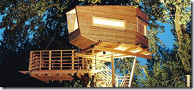
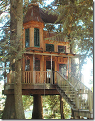
I have been dying to write a post about tree houses. One day, in my wildest dreams, I am going to build one of these for myself… but in the meantime, I can just just fuel my imagination….

Yellow Treehouse Restaurant – Auckland – a Fairytale restaurant 10m up a redwood tree.

 image

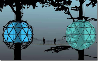
image Some great treehouse articles on the busyboo design blog include the Bubble Treehouse:

image

Enchanted structures by Japanese master treehouse builder Takashi Kobayashi – commissioned by Nestle for a commercial:

image

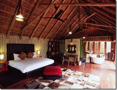
Or the African Treehouse lodge in South Africa with wonderful outdoor bathroom:

image

image 

Free Spirit Spheres – built by Canadian Tom Chudleigh which are suspended from the trees. You can buy them and move them to your own location or stay the night in one for between $125 - $175pn and feel the gentle rocking in the wind for yourself:

image

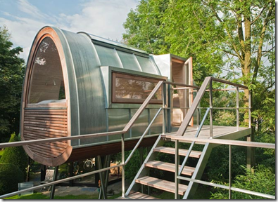
image Or the O2 Sustainable Treehouse inspired by a Japanese lantern and built from sustainable materials with no bolts or nuts so it doesn’t hurt the tree. They can be ordered as a self installing kit.

image

image

Check out one of the world leaders in treehouses – the Baumraun Cooperative have designed and built projects all over the world. Order your own made to order treehouse:

image

image

image

image

image

Some companies are set up to build treehouses for personal use, for studios or hideaways and will build them to your requirements like US firms Treehouse Workshop or the Living Treehouse, as well as retreats and tree homes:

image

image

imageimage

Treehouses can form guestrooms or family rooms as an extended part of the main house like this one outside Salzberg as featured on Wallpaper.com.

image 4Treeshouse created by Studiolukaszkos in Canada – suspended around 4 trees and designed to sway with them – built across 3 floors:

image

image

image

Swedish architects Tham & Vedegard Architects Tree Hotel

image

image

Do a search for treehouse and you will be surprised what amazing, inspirational homes and places you will find that captivates your imagination…. I know I was blown away.

02 April 2010

Designers Guide to Sydney – Easter Weekend

What can one do if they are in Sydney this weekend over Easter? This is the first Easter I can remember in a very long time that I haven’t battled the Thursday afternoon traffic to snail my way along the highway to some relaxing holiday destination, usually to get rained out and return a few days later in even worse traffic.
Instead, I have chosen to hang in my city and explore. So my favourite design and style guide weekend picks for those lingering in Sydney…

CarriageARTworks – one of my favourite venues with great markets (growers and artisan) and performance space, but this weekend a free art exhibition celebrating art from the city’s fringe.
image
Potter through Surry Hills and meander through some of the great stores… including the Surry Hills Neighbourhood market on Saturday 3rd April with all sorts of antiques and collectibles, international foods, plants, vintage clothing…
 image
I quick wander through I Ran the Wrong Way store for some interesting ethical, sustainable and local goods:
image
Must have a quick stop at the Bourke Street Bakery cnr Bourke and Devonshire streets for the yummiest cakes, breads and pastries in town:
image image
Try not to miss the Eliasson exhibition at the MCA in the Rocks – it ends April 11th and is a must see – imagine a circular room ten metres in diameter illuminated by a soft purple light or a two-storey moss covered wall, or a sparkling white metropolis made from Lego.
image
China Town Night market – open every Friday night:
image
Fringe Bar Markets – squashed into the Fringe Bar on a Saturday full of vintage, retro and hand made goods.
 image
Dr Sketchy’s at the Arthouse Hotel – Burlesque drawing classes on Tuesday night – have a glass of wine and a scribble:
image image
Madhatter’s Tea Party on Easter Sunday in the Victoria Rooms – a stunning venue in an old garage on Victoria Street Darlinghurst.
image
There’s lots to do this weekend – wander the streets, lots of markets, Bondi to Bronte walk, buy local produce for dinner with friends…. why go away at all!
Related Posts with Thumbnails